An ecommerce website is a digital shop on the internet. It allows people to look at products and buy them from their homes. It is a wonderful time to be in business today, as there are hundreds of thousands of businesses selling products and services all over the internet. With so much competition in the marketplace, you can expect to have a lot of customers to compete against; if your website does not function well, expect that your visitors will not stay on your site and will find other web sites to purchase from. Therefore, the way a website looks and works is very important.
The design of an online store changes how people think. It guides their choices. It influences whether they spend money or close the page. Many business owners think that low prices are the only thing that matters. This is not true. A website must look professional to attract buyers. It must be easy to navigate. Every page must load quickly. This article explains how Ecommerce web design affects the choices of shoppers. It looks at the ways a clean layout can increase sales. It shows how small changes to an online shop can make a big difference to your business revenue.

First Impressions and Consumer Trust
When a person enters a physical shop, they look around. They see if the floor is clean. They notice if the items are organized. If the shop is dirty and messy, the person will walk out. They will not trust the quality of the goods. An online shop works in the exact same way.
The first page a user sees creates an immediate impression. This impression affects how the user feels about the whole company. If the website looks professional, the user feels safe. If the website looks old or broken, the user becomes worried. They will think the business is a scam. They will worry that the company will steal their money. Building trust is the first step in online selling. Without trust, a customer will never enter their credit card details. Professional ecommerce website design is the tool that creates this necessary trust.
The 0.05-Second Rule
People reach their decisions very quickly when they’re buying online. Research indicates it takes a user just 0.05 seconds to make a first impression about a website. This is but a second in time. In this small moment, your user will determine whether they will like your page or not. They make their own choices of whether to stay or go.
This judgment happens in the subconscious mind. The brain looks at the overall appearance of the page. It processes the colours, the balance, and the amount of text. If the page looks confusing, the user reacts negatively. They will click the back button immediately. This means your website must be visually pleasing right from the start. You do not have time to explain your products in that first split second. The visual layout must do all the work. High-quality ecommerce website design ensures that this first quick judgment is positive.
Design Principles That Drive Sales
Design is not just about making a website look pretty. It is about helping a business grow. Good design functions as a quiet sales assistant. It guides the customer through the digital shop. It points them toward the best products. It makes the journey from the homepage to the payment screen smooth.
Reducing Friction in User Experience
Friction is anything that makes a task difficult for a user. In an online shop, friction can take many forms. A slow page is a form of friction. A confusing menu is also frustrating. If a customer cannot find the search bar, they experience friction.
Great ecommerce UX means eliminating any obstacles. It is important that the design team view the website from the customer’s perspective. They must make the layout logical. The shopping cart icon should always be at the top right corner, for instance. This is the place they’d want to see it. Putting it at the bottom of the page will cause confusion. Simple words such as ‘Shop’, ‘About Us’, and ‘Contact’ must be used in the navigation menu. Don’t use words that are clever or unusual that people don’t know. When you remove friction, shopping becomes enjoyable. Customers will buy more items when the process is easy.
Mobile-First Is a Must in 2026
The year is 2026. Most people do not use desktop computers to shop online today. They use their mobile phones instead. They buy clothes while sitting on trains. They order groceries while waiting for a friend. They browse electronics while resting in bed.
This means your website must look perfect on a small telephone screen. A mobile-first design strategy means developers build the mobile version of the site first. Then they expand it for larger computer monitors. For mobile, all items need to be small. The size of the buttons should be sufficient for easy thumb taps.
The Mobile Conversion Gap
Many online businesses notice a strange trend in their data. They realize that a large proportion of their visitors are on mobile phones. But the majority of sales are still on desktop computers. This difference is called the mobile conversion gap.
When consumers are not busy, they like to look at products on their mobile devices. When they are ready to buy, though, they resort to a computer. Or they don’t purchase the product altogether. This is because a lot of websites are not easy to navigate at the last moment when you’re making a phone purchase.
It’s cumbersome to type long numbers on a small phone keypad. Users will become tired if they are required to enter too much information on a form. They will close the website and promise themselves to buy it later. Often, they forget about the item completely. This means the business loses a sale because of poor design. Closing this gap requires expert Website development Singapore. The software must be designed to make mobile payments fast and effortless.
Designing a Frictionless Checkout
The checkout page is the most critical area of an online shop. This is the area where a browser becomes a paying client. Unfortunately, that is where the majority of businesses lose their sales as well. A lot of shoppers put things into their carts but never buy them. This is what’s known as “cart abandonment”. This action is called cart abandonment.
The majority of cart abandonment cases are found to be due to design problems. A cumbersome and complicated checkout process discourages customers. This problem can be fixed by doing what is possible to shorten the payment process. Don’t require customers to register a username and password to purchase. Provide a guest check-in/out service. This enables individuals to purchase things without having to go and fill out lengthy registration forms.
The checkout page should be only about the purchase, without distractions. Remove the main navigation menu bar from this page. You don’t want the customer to go to another section. Only the necessary information should be requested, like payment numbers, delivery address, etc.
Usually you will see a list of steps listed at the top of each page on your website indicating what needs to be done to complete an action. A progress bar may also allow a user to see how far along they are with regards to completing the transaction. This pictorial walkthrough helps to maintain their motivation to complete the transaction.
Personalisation and Visual Hierarchy
Visual hierarchy is a design term that means organizing elements by importance. It tells the eye of the customer what to look at first. Important things must be large, bright, and placed at the top of the page. Less important things must be smaller and placed lower down.
For example, the “Buy Now” button should be the first thing that is seen on a product page. It should be a color that will be noticeable from the background. Use a bright blue or green button if your website’s background is white. A grey button is not recommended; it will merge with the background. If customers have to look for the purchase button, something is wrong with your visual hierarchy.
Personalisation takes this concept further. It uses visual hierarchy to show unique offers to different user groups. A welcome message should be sent to customers who have placed an order before, with a list of their old orders. As a new visitor, you will be shown a discount code and your top sellers. This smart arrangement makes the website feel alive and personal.
Clear Typography and High-Quality Media
You will want to ensure that your website can be read on all devices. The last thing you want to do is lose a sale because your font is not a proper size. Main text blocks should not contain decorative or cursive text. The fonts are fancy, but hard to read when displayed on small screens for mobile devices. Use simple, modern and clean fonts for text.
Then there’s the font size as well. A small font size may cause the user to develop eye fatigue; whereas, a font size too large will create an unorganized look to your page layout. Bold fonts can also help users to move through the various pages of your site by acting as headings to separate paragraphs of text. It is important to note that most users on the internet will not read every single word on any given web page, most users will skim the text looking for what they need. Clear headings help them scan your pages efficiently.
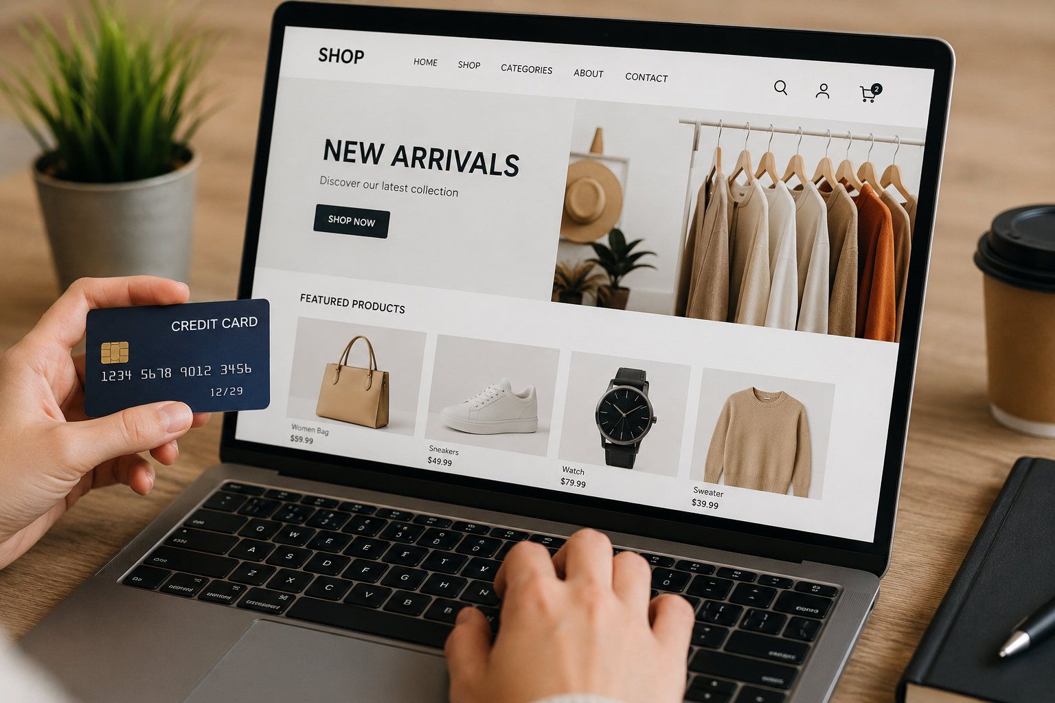
Media elements like photos and videos are also essential for sales. Since online shoppers cannot hold the item, they need high-resolution images. Your website must show the product from multiple angles. Include a zoom feature so users can examine the material quality. Product videos are even better. If you can make a short video of a model wearing a jacket or a person using a tool, you’re doubling your sales. It is quicker to answer customer queries than a long paragraph of text.
Security Features and Visible Badges
Online crime is a big worry for modern shoppers. People hear stories about data theft every day. They are very careful about where they share their credit card numbers. Your website design must show customers that your platform is perfectly safe.
You must install security certificates on your website servers. This protection changes your web address prefix from “http” to “https”. It also displays a small padlock icon next to your website name in the internet browser.
You should also place clear security badges on your checkout page. These badges show the logos of trusted payment providers and security systems. When a customer sees these familiar symbols, their anxiety disappears. They feel confident that their financial details are safe from hackers. Security is not just a backend technical job. It must be visible in the frontend design to influence the customer’s choice.
Final Thoughts
The design of your online store decides the future of your retail business. It is not just about choosing pretty colours or nice pictures. Every button location, text style, and menu link changes how a consumer thinks. A confusing or slow website drives buyers away instantly. It destroys trust and reduces your sales revenue.
Conversely, an online shop built with excellent ecommerce website design principles creates a successful path for growth. It has a clean layout to welcome users, clear reviews to build trust and it makes payment easy on mobile phones.
If companies want to rise above the competition, they need to consider the design of their website as a main investment. Technology will keep evolving and the digital market will evolve and change accordingly. Looking for the best ecommerce development services in Singapore, you can be sure that your website is always modern, fast and secure. This will enable you to provide a seamless customer experience and move them from being occasional to loyal customers and keep your business growing for many years.
Author Profile

I am Morris Edwards, and I am working as a manager at Awebstar, a prominent web design and development company in Singapore. I have expertise in digital marketing, SEO, mobile app development, logo design, and social media marketing.